Say hi to Perpetual's mini-player. In addition to this, a few other things have been introduced, tweaked or completely changed:
1) The slider buttons at the top will allow you switch between the artwork when you're in full-player mode and the statistics for the current song ("just how addicted ARE you?").
2) I changed the progress bar. This feels a little better to me.
3) The perpetual range markers have been tweaked and embiggened. The last ones didn't feel like they belonged in a Mac application. Also, bigger targets are always a plus.
4) Added a pop-over when a marker is selected, showing you not only the timecode where your marker sits, but also the beat number. Beat snapping is EXTREMELY important to Perpetual's success.
It's little projects like this that I love, Bryan. And it's just awesome when someone like Kalle jumps on board to help out. I'm excited to see this develop!
@Hamish Macpherson — It's a great feeling to be finally working on something like this. I've had so many app ideas, but none of them so far have made the, "yeah I could see this being released" list. This is the first and Kalle has been awesome. :)
FWIW, I actually liked the range markers/label when they were smaller. I certainly understand the need to have larger grab targets - perhaps you could embiggen them as you move to grab them?
@Derek Punsalan — Now if only this happened for everything... :D
@Matthew Anderson — I don't know... the newer markers have grown on me. Also, I know that label isn't going to look good to me until it's implemented in code. Stupid Photoshop and its text rendering. :( I'll keep hacking.
I've gotten around to refactoring some of the window's layout in Xcode and some compelling force drove me back into Photoshop. That said, this update adds a bit more polish on top of the shot this rebounds.
What changed?
1) The play/pause button is now in the footer as is the loop counter. As such, the title now takes the full width of its bar, which just feels better.
2) I've removed "Perpetual Range" and replaced it with a simple infinity symbol. This'll make a lot more sense once the application icon is released. As you can see, the symbol is also used next to the counter.
3) Tick marks! Their opacity will change (read: brighten) when you grab a range marker.
And, that's it. :) Check out the attachment to compare the full sizes of each version. Remember, if you'd like to follow our progress, visit us here: https://github.com/revyver/perpetual
(One more thing... designing @2x is pretty awesome, even if the application won't be 2x... yet.)
If you caught me on Twitter today, I was asking a fewquestions about the importance of certain user interface elements in a music app. Reason being? I hit a brick wall because of one feature.
That feature? The ability to manually input times for the markers in addition to dragging the slider handles. The problem came about when I wanted to add labels to the play/range area while not losing the style I had already set.
At the top, I tried throwing two buttons on either side of the footer bar, but it felt a bit crowded. Unintuitive? Maybe, since the buttons sit far enough away from the range selector.
The bottom is my most recent attempt: completely going back to the drawing board, even going as far as implementing a waveform view as the default play range. Harder to implement? Yeah, most likely.
I'd love to get some feedback on this one, as I'm still not to sure as to which direction I should take. Maybe I'll sleep on it. Also, there are a few other changes in here that I'm sure you'll take note of. :)
(The farther I get into this project, the more respect I have for desktop application designers.)
11 Responses
Pro
Bryan Veloso
Say hi to Perpetual's mini-player. In addition to this, a few other things have been introduced, tweaked or completely changed:
1) The slider buttons at the top will allow you switch between the artwork when you're in full-player mode and the statistics for the current song ("just how addicted ARE you?").
2) I changed the progress bar. This feels a little better to me.
3) The perpetual range markers have been tweaked and embiggened. The last ones didn't feel like they belonged in a Mac application. Also, bigger targets are always a plus.
4) Added a pop-over when a marker is selected, showing you not only the timecode where your marker sits, but also the beat number. Beat snapping is EXTREMELY important to Perpetual's success.
And, that's it. :) Remember, if you'd like to follow our progress, visit us here: https://github.com/revyver/perpetual
3 months ago
nice work!
3 months ago
Pro
Bryan Veloso
@Yoga Perdana — That was quick! Thanks! :)
3 months ago
Pro
Hamish Macpherson
It's little projects like this that I love, Bryan. And it's just awesome when someone like Kalle jumps on board to help out. I'm excited to see this develop!
3 months ago
Pro
Bryan Veloso
@Hamish Macpherson — It's a great feeling to be finally working on something like this. I've had so many app ideas, but none of them so far have made the, "yeah I could see this being released" list. This is the first and Kalle has been awesome. :)
3 months ago
Pro
Steffen Nørgaard Andersen
Great work!
3 months ago
Pro
Derek Punsalan
So awesome to see this go from random shower idea to this... All in a short span of time.
3 months ago
Pro
Matthew Anderson
Really happy to see this moving along, Bryan!
FWIW, I actually liked the range markers/label when they were smaller. I certainly understand the need to have larger grab targets - perhaps you could embiggen them as you move to grab them?
3 months ago
Pro
Bryan Veloso
@Steffen Nørgaard Andersen — Thank you!
@Derek Punsalan — Now if only this happened for everything... :D
@Matthew Anderson — I don't know... the newer markers have grown on me. Also, I know that label isn't going to look good to me until it's implemented in code. Stupid Photoshop and its text rendering. :( I'll keep hacking.
3 months ago
Rebound
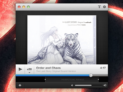
Perpetual (Mini Player)
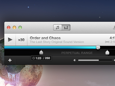
 — Round 2
by Bryan Veloso
ABT: Always be Tweaking
I've gotten around to refactoring some of the window's layout in Xcode and some compelling force drove me back into Photoshop. That said, this update adds a bit more polish on top of the shot this rebounds.
What changed?
1) The play/pause button is now in the footer as is the loop counter. As such, the title now takes the full width of its bar, which just feels better.
2) I've removed "Perpetual Range" and replaced it with a simple infinity symbol. This'll make a lot more sense once the application icon is released. As you can see, the symbol is also used next to the counter.
3) Tick marks! Their opacity will change (read: brighten) when you grab a range marker.
And, that's it. :) Check out the attachment to compare the full sizes of each version. Remember, if you'd like to follow our progress, visit us here: https://github.com/revyver/perpetual
(One more thing... designing @2x is pretty awesome, even if the application won't be 2x... yet.)
3 months ago
Rebound
Perpetual Experiments
by Bryan Veloso
If you caught me on Twitter today, I was asking a few questions about the importance of certain user interface elements in a music app. Reason being? I hit a brick wall because of one feature.
That feature? The ability to manually input times for the markers in addition to dragging the slider handles. The problem came about when I wanted to add labels to the play/range area while not losing the style I had already set.
At the top, I tried throwing two buttons on either side of the footer bar, but it felt a bit crowded. Unintuitive? Maybe, since the buttons sit far enough away from the range selector.
The bottom is my most recent attempt: completely going back to the drawing board, even going as far as implementing a waveform view as the default play range. Harder to implement? Yeah, most likely.
I'd love to get some feedback on this one, as I'm still not to sure as to which direction I should take. Maybe I'll sleep on it. Also, there are a few other changes in here that I'm sure you'll take note of. :)
(The farther I get into this project, the more respect I have for desktop application designers.)
2 months ago