@Mark Gilliland thanks Mark, I got your feedback. I think I need that separation line, because it help visual the selection area of the basket. I intentionally using different icon because it's adding action. But I agree I perhaps should use a basket one. But it should be "My Basket"? weird.. but thanks!
6 Responses
Pro
Bady
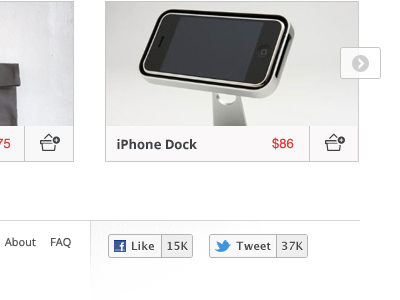
The social button, and thumbnails which are part of Index page.
-----------------------
Check out the Full Page
Muted color for the social button
Which one do you prefer?
over 1 year ago
Pro
Avinash Tripathi
very nice blues and grey optimal :)
over 1 year ago
Pro
Mark Gilliland
A border, separating the image and the title, would be good, I'm thinking. Also, do you need the line separating the cart icon?
over 1 year ago
Pro
Mark Gilliland
You're also using two different icons to represent the same thing with the cart… I prefer the basket over the trolley.
over 1 year ago
Pro
Bady
@Mark Gilliland thanks Mark, I got your feedback. I think I need that separation line, because it help visual the selection area of the basket. I intentionally using different icon because it's adding action. But I agree I perhaps should use a basket one. But it should be "My Basket"? weird.. but thanks!
over 1 year ago
Rebound
Product Page
by Bady
Part of product page.
Make sure you check out the Full Page
It's pretty long.
over 1 year ago