I think the placement is not that odd. But they really look like buttons, it's not really clear that I would be on the 'recommended' page. Maybe make the 'recommended' breadcrumb green or blue?
If you still think the placement is odd maybe you can make an extra bar between the top menu and header or introduction of the page. These are just suggestions and maybe they will solve your problem. Overall look is great by the way, I love the clean look and strokes of the images.
I think it looks great to be fair, and the breadcrumb placement works for me. I'd probably try the placement of the header items a little like this though.
4 Responses
Pro
Andrew Cornett
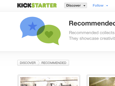
The placement of the breadcrumb feels a little odd, any ideas?
almost 2 years ago
Pro
Tim Boelaars
I think the placement is not that odd. But they really look like buttons, it's not really clear that I would be on the 'recommended' page. Maybe make the 'recommended' breadcrumb green or blue?
If you still think the placement is odd maybe you can make an extra bar between the top menu and header or introduction of the page. These are just suggestions and maybe they will solve your problem. Overall look is great by the way, I love the clean look and strokes of the images.
almost 2 years ago
Pro
Liam McKay
I think it looks great to be fair, and the breadcrumb placement works for me. I'd probably try the placement of the header items a little like this though.
almost 2 years ago
Pro
Andrew Cornett
Tim: Ah totally dude, I've now changed them to look less button-like. Thanks for the feedback!
Liam: *gasp* that alignment is definitely better. Whoops! Thanks for that man.
almost 2 years ago