"Crossfit 12 Stones" Logo

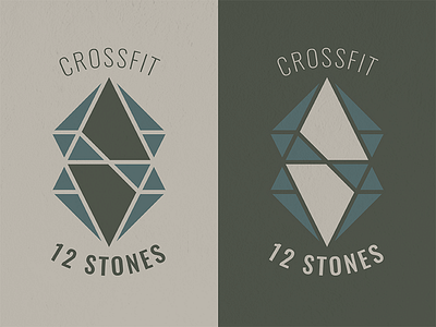
First client of the year! A power couple, who are starting their own business together, were wanting a logo to stand apart from the typical crossfit logos that are currently out there. Not so aggressive. Strong, but neither too masculine nor feminine - well-balanced. Goals: One stone broken into 12 pieces. A stone parting water, and/or water wrapping around a stone. The letter "S" hidden. Go to this link to see the design process: https://www.behance.net/gallery/62512855/Crossfit-12-Stones-Logo-Design-Process


