Arcade-Inspired Invites Part 2

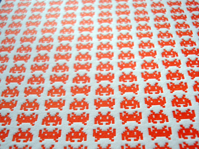


Here's a view of what would be the back of the wedding invitation. I was thinking these would also look pretty nice blind-embossed. The orange color was just to vibrant to not try, though. :)
Attached are two other larger views of the finished samples. I'm not happy with the light blue at all. It looked a lot darker while mixing, but I think it was the handmade paper (with crazy absorbency and fun color flecks) that made it difficult to read. Next time I print samples, I'll be using a different blue for sure.


