Img_0169-2

New website for Piictu 1.♥

1329237203945

1 Attachment

28 Responses (page 1 of 2)

  1. Pro Img_0169-2 Robin Raszka

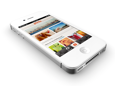
    Well, here is a mockup of new Piictu's website. I don't quite like those sharing buttons so I'll probably change them in a bit + the positioning is still little bit weird on the production version... See it live (Updated)

    Opinions?

    Oh, there's an update in the App Store too.

    likes

    4 months ago

  2. Pro Dribbbleplease Blake Brown

    NIce and Clean Robin!

    4 months ago

  3. Pro Studio_blue_small Robert van Klinken

    Render is insane, i'd add the piictu name next to the mark tough.

    likes

    4 months ago

  4. Pro Dribblee Marvin Kennis

    Beautiful. I agree with Robert. Also, the font of the "free" text on the green button seems a bit off, as there's nothing else on the site that refers to that kind of style.

    likes

    4 months ago

  5. Pro Foto Frantisek Kusovsky

    Im not sure about the "get the free app" button, but its very nice to come up with something completely different for landing page!

    likes

    4 months ago

  6. Pro 164850_10150155017069867_662254866_8346387_6400765_n Lukas Bugla

    Fantastic!

    4 months ago

  7. Eightbit-2875e553-fd4c-413e-84fa-5405e0832174_reasonably_small Facundo Gonzalez

    Love it, really simple and nice.

    4 months ago

  8. Pro Big Maxwell Barvian

    I actually really liked the social buttons on the right, although I must admit it bothered me when they didn't respond to clicking :P

    4 months ago

  9. Mysterio Jason Kirtley

    Simple and beautiful.

    4 months ago

  10. Pro P1020211 Jonathan Moreira

    Love the simplicity.

    4 months ago

  11. Pro 293456_10150880667995461_855885460_20886596_1954620417_n Jon Øvrebø Dubielzyk

    The shaddow under the phone seems a bit odd to me. I actually like that you dropped the Piictu app, maybe not good from a usability standpoint, but like the look.

    4 months ago

  12. Pro Face Michal Vasko

    nice & simple

    4 months ago

  13. Pro Screen shot 2012-04-12 at 8 Nick Slogget

    Quick and Dirty. http://d.pr/OpxR

    likes

    4 months ago

  14. Pro Vin-avatar Vin Thomas

    This is really slick Robin. So darn clean.

    4 months ago

  15. Pro Liam Liam McKay

    The button isn't terrible, but I do think it could look at lot better. Everything else is perfect.

    4 months ago

  16. Pro Avatar Charles Riccardi

    Robin, I agree with @Liam McKay regarding the button. It looks like it was made for a 2x graphic, but accidentally used for web. Love the color and the font used for "free". Clean and simple execution. My favy.

    4 months ago

  17. Pro Image_reasonably_small Tyler Reckart

    The render is great. I agree with @Liam McKay and @charlesriccardi as well on the subject of the button. It is not bad but I think that it is a bit overdone. Probably ease up on the gradients and glow. Maybe make it a bit smaller. Other than that, superb.

    4 months ago

  18. Pro 6b820ba8-b9af-44ed-96b7-3075d2fdf1c0 Mitchell Bernstein

    Oh ok, new interface touches too...

    4 months ago

  19. Dpencilpusher_ Dapo Olaopa

    One thing I really liked about the previous version's design is the semi-transparent tab bar, I don't know why it's all opaque now but I think you should bring that back. As for the website, I think the name "Piictu" should accompany th logo and I think the iPhone with the screenshot should be upright so people can see the app clearly.

    likes

    4 months ago

  20. Pro Img_7576 Christopher Magruder I Une...

    Awesome!

    4 months ago

  21. Pro Img_0169-2 Robin Raszka

    Sharing button updated. Actually I quite like the weirdness of that download button font :)

    @Dapo Olaopa We want to push the symbol, instead of name + it's already on the screenshot so I don't want word piictu twice.

    Also, I think I'll update a little bit the render (shadows).

    4 months ago

  22. Looking-up Sam Vermette

    The rendering is terrific! Looks real, except for maybe the shadow. New website looks great, love the "available for your iPhone, yo" :P

    likes

    4 months ago

  23. Pro Avatar Ramotion

    @Robin Raszka nice 3d model man! :)
    We spent a lot of time to create very accurate models of iPad and iPhone at our website

    likes

    3 months ago

  24. T Andrey S. Rodrigues

    amazing

    3 months ago

  25. Pro Me Daniel Máslo

    I really like the symbol-logo of Piictu, but every page (homepage, blog, help) has different logotype...

    3 months ago

keyboard shortcuts: previous shot next shot L or F like