Op-1

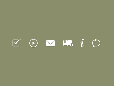
Action Icons Rebound

Shot_1281052081

25 Responses

  1. Op-1 Jesse Dodds

    Just thought I'd try my hand, adjusting where I thought they could be tweaked. Great work Rogie.

    likes

    almost 2 years ago

  2. Avatar_benek-static Benek Lisefski

    The bookmark shape bothers me. At a small size the chunk it takes out of the book makes it unrecognizable.

    almost 2 years ago

  3. Sits2 Derrick Pelletier

    Definitely good improvements. Good eye

    almost 2 years ago

  4. Avatar Filipe Storarri

    WoW great adjustments :D Terrific icons!

    almost 2 years ago

  5. Pro Mtn_rogie Rogie

    Dude, loving your adjustments!!!!

    likes

    almost 2 years ago

  6. Pro Me Hunter Hastings

    Agreed, nice changes

    almost 2 years ago

  7. 37177_1529215145563_1090230245_31392627_1586237_n Chris Lee

    Great improvements to some great icons!

    likes

    almost 2 years ago

  8. Pro Cyan Robert Padbury

    superb tweaks!

    almost 2 years ago

  9. Tux_v2 Russell Greenwood

    You're far too good at what you do.

    Love the subtle differences in the shading on the envelope and the skinniness of the power cord. Winner.

    almost 2 years ago

  10. Dribbble Marty Alchin

    As far as I'm concerned, feedback like this is what would make a pro Dribbble account worth having. :)

    almost 2 years ago

  11. Pro Logo Joel Helin

    Huge improvement!

    almost 2 years ago

  12. Pro Pic Benjamin De Cock

    Splendid. The tick is absolutely perfect!

    almost 2 years ago

  13. Pro 303877_2637736747832_1387911606_3012133_361803021_n Erika van der Bent

    great mail icon

    almost 2 years ago

  14. Jono_sunglasses2 Jono Mallanyk

    My favourite change was moving the plus sign in the 'add bookmark' icon. Makes so much sense in retrospect. The whole set has a sense of "beautiful logic".

    almost 2 years ago

  15. Pro Davykestens4 Davy Kestens

    The only thing that bothers me is the change you made on the envelope. I preferred the previous one.
    Somehow, I'm not particularly fond of removing the opposite connector of the text balloon.

    almost 2 years ago

  16. Pro Tintype-tim-square Tim Van Damme

    Rogie, I love you, but you just got pwnd.

    likes

    almost 2 years ago

  17. Lol Pedja Rusic

    Mucho betr ;)

    almost 2 years ago

  18. Pro Mbw Michael Spitz

    Very sharp!

    almost 2 years ago

  19. Pro Usa_avatar_3 Bobby McKenna

    "As far as I'm concerned, feedback like this is what would make a pro Dribbble account worth having. :)"

    But... we can do this already. What?

    almost 2 years ago

  20. Dribbble Marty Alchin

    @Bobby In my comment on the Dribbble Pro thread, I pointed out that quality feedback is fairly rare, compared to the multitude of "this is awesome!" comments. I'd pay for an account if it meant I could get better chances of feedback like this.

    So yes, this can happen already, but it's certainly not the norm. I don't know if paid accounts are really an answer for it anyway, but that's a conversation for a different venue. :)

    almost 2 years ago

  21. Pro Mtn_rogie Rogie

    I think that Jesse Dodds is the embodiment of quality feedback. He actually phrased his feedback amazingly with this rebound.

    Cheers Jesse!

    likes

    almost 2 years ago

  22. Pro Usa_avatar_3 Bobby McKenna

    Marty, I think the solution is simple: Ask for feedback when you post a shot. People are far more likely to offer their two cents when they know someone is going to be receptive to it.

    almost 2 years ago

  23. Displayicon Shikeb Ali

    So sharp they look sharp like the edge of a samurai sword !!

    Wonderful work !

    almost 2 years ago

  24. Pg Michael Pons

    Very organic, yet sharp. Great Shot

    almost 2 years ago

  25. Pro 3f6bfe56a32e11e1a9f71231382044a1_7 zee7 ✽

    they are nice, love them :)

    over 1 year ago

keyboard shortcuts: previous shot next shot L or F like