Arizona Cardinals

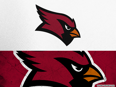
I really love the direction the Cards took with their most recent logo update, but the cardinal head was never really shaped like a bird's head and the eye is comically large. I've tried to keep the same motion to the logo while fixing these issues.


