#SPACEDchallenge Second Logo

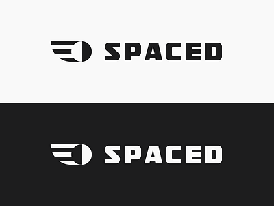
My second logo design entry for the #SPACEDChallenge.
The second logomark consists of a depiction of a planet travelling and orbiting through space and the movement is illustrated by sweeping stripes that also shape into an image of a wing to make a familiar association with flight and commercial air travel.
Moreover, the planet is split in half into inverted colors to directly reference the the shape of the directly sunlit portion of the Moon as viewed from Earth but also in order to carve out the shape of the planet within the mark.
The logotype is a custom, san-serif type inspired by the style of lettering used in the logos of companies such as Sennheiser and Soehnle, that manufacture excellently built and engineered products. The letterforms convey solidity, precision, reliability and practicality, which are qualities that would make passengers feel safe when deciding to travel through space.
Overall, the mark and the type has a retrospective elegance that quickly establishes a confident image to cement SPACED as a trustworthy service for space travel.
Dropbox link to the presentation: https://goo.gl/vzSi8y