#SPACEDchallenge Logo

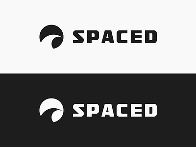
Logo design for the #SPACEDchallenge, as per the brief, the aim of the design was to communicate speed of travel and flight, safety as well showcase the variety of routes and destinations without specifically referencing a single planet.
The logomark consists of a simple illustration of a contrail to reference the launch of a spacecraft and emphasize the magic of flight. Additionaly, when the trail illustration is placed within the circular container, it creates a hidden image of a planet through the negative space in the right-bottom corner of the mark, which represents space travel as well as signify the safe landing of the spacecraft on that planet.
The logotype is a custom designed san-serif type inspired by the style of lettering used in the logos of companies such as Sennheiser and Soehnle, that manufacture excellently built and engineered products. The letterforms convey solidity, precision, reliability and practicality, which are qualities that would make passengers feel safe when deciding to travel through space.
Overall, the mark and the type has a retrospective elegance that quickly establishes a confident image and cements SPACED as a trustworthy commercial service for space travel.
Dropbox link to the presentation: https://goo.gl/vzSi8y