De Rode Pieter Scheen Webshop

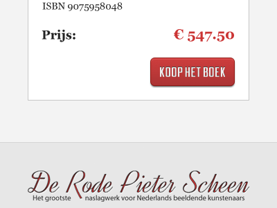
The call to action button and a part of the footer for the website for the book 'De Rode Pieter Scheen'. Still in doubt about the type... I welcome your comments with arms wide open!
The call to action button and a part of the footer for the website for the book 'De Rode Pieter Scheen'. Still in doubt about the type... I welcome your comments with arms wide open!


