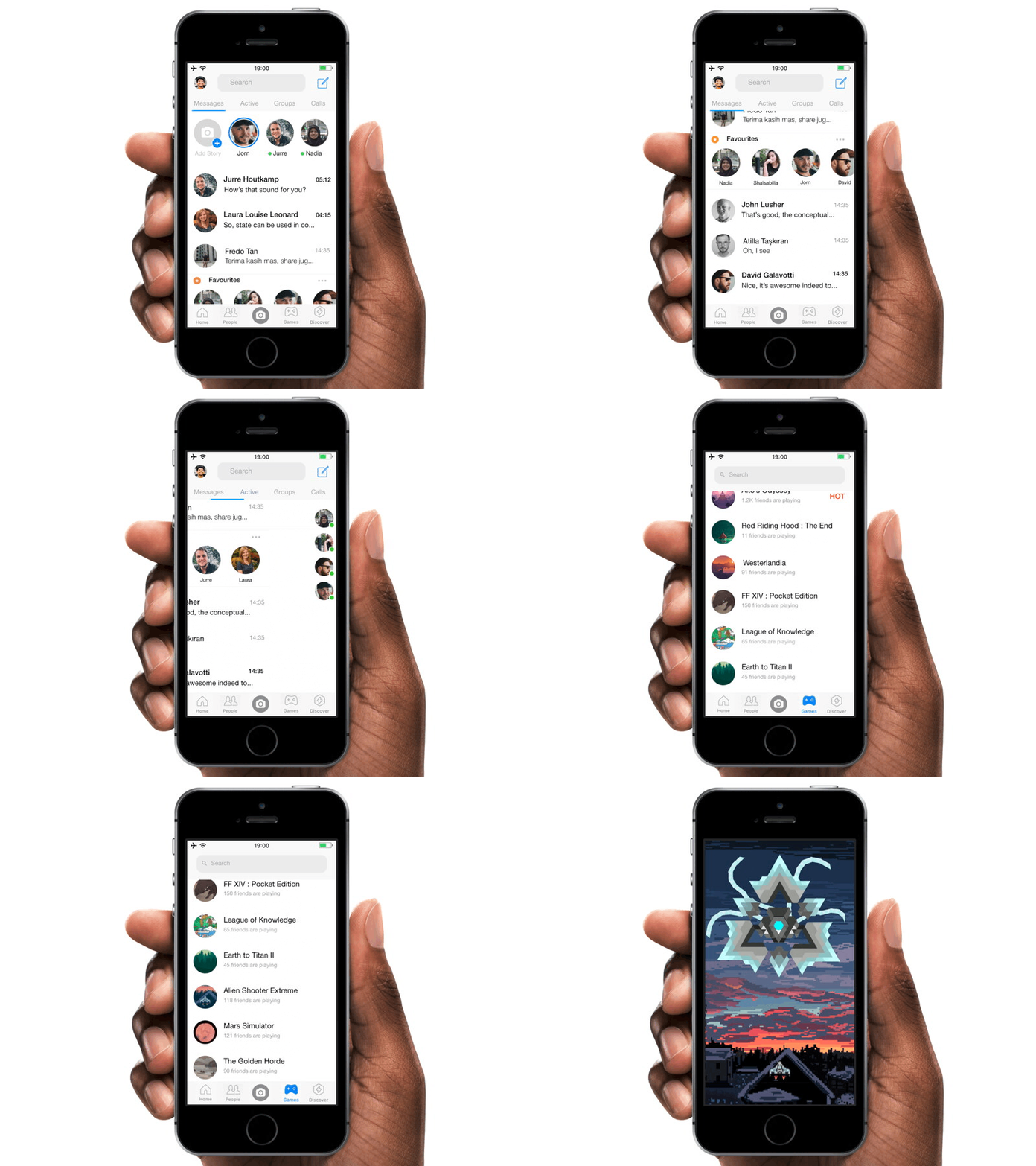
Re-Engineered Facebook Messenger
Facebook Messenger certainly one of the best yet intuitive chat platform. But, there are several minor flaws which I discovered in the original app (mainly focusing on Game section), these are several key pointers :
a. Poor search label formation
In the original app's game section, the search label in the header seems positioned too close ( Y-axis ) to status bar and the borderline which separates game list content with the header one. In my perspective, adding spaces in between certainly affects user's eye-sight to rest awhile prior dominantly focused to the game lists.
b. Little to know information about the games
To think of UX Engineer at Facebook whom favor simplicity for better experience - which is great - , I do think that showing more detailed information about the games will do great for Facebook's reputation ( not to mention, appreciating the game developers as well ). Thus, I provide simple solution, which is :
- Adding amounts of player which indicates one game as a
trend one to attract more players.
I do think that this feature marked such paramount importance to attract more users to explore the games, just like the old days of Mafia Wars ( I played and reached more than Level 100 +, lol ).
But, for games which obviously not a trend one, users can still pitch how many of their friends are playing the game, which provide great appreciation for the developers too. Overall, these are minor issues, Facebook are doing such amazing job.
By the way, the game shown in the prototype is my debut post on Dribbble when I was invited by @Jurre Houtkamp . Nonetheless, this work was made using Framer.
Contact me on :
cordovahandri.ansyah@gmail.com


