Find designers
Designer search
Quickly find your next designer
Post a job
The #1 job board for design talent
Inspiration
Courses
UX Diploma
Learn UX design from scratch in 6 months
UI Certificate
12-week UI skill building for designers
Live interactive workshops
with design professionals
Jobs
Go Pro
Log in
Dribbble: the community for graphic design
Advance your career with a Professional Diploma in UX Design
Learn more
Log in
Sign up
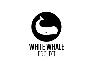
White Whale Logo
Bucky Flowers
Follow
Following
Like
#FFFFFF
#010101
#A2A2A2
#616161
Download color palette
I'd love to get feedback on this logo as a whole and especially the whale illustration.
black
gotham
illustration
logo
whale
white
View all tags
Posted on Feb 10, 2012
2,104
3
9
2
View feedback
Bucky Flowers
More by Bucky Flowers
View profile
Previous
Next
Loading…