Skookum Header

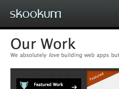
Been making some adjustments to http://www.skookum.com (my employer). Header used to be the same as the other dark texture. I thought it looked ugly/bland so I made the texture more subtle and added a very slight light blue gradient.
If you take a look at the rest of the site, I think a number of little adjustments here and there could go a long way to make this a more solid design.


