Quora : How I Redesign?

As one of the greatest League of Knowledge platform, I highly believe that Quora certainly deserves the title of 'must have app' before the end of times.
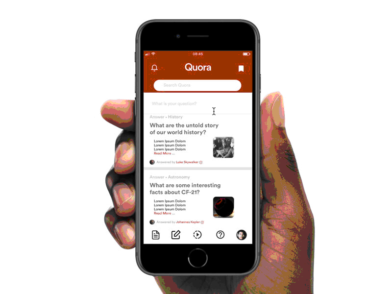
But, there are several minors which I discovered in mobile feed section, especially each page breaks (the "read more" sign), post-thumbnails, and user identification ( who did the asking and answering ).
In this project, I redesigned Quora's interaction design mainly in the feed or home section with several pointers :
A. Card view to fix static "Remove Post" interaction
--------------------------------------------
Sometimes, we lost our way to remove or delete a post (both answer or question) due to unreliable source and all that. But, I have this experience of difficulties where my big-sized fingers are unable to remove the post, properly.
Keep in mind that this is minor issue, but I tried to discover a general solution (which works for everyone, too) for Quora to use card view, where people simply swiped to remove a post.
B. Clear space between page breaks and post captions
--------------------------------------------
The "read more" sign sometimes sit too close with the caption, and with those grey color and regular-family typography, I often meet difficulties to distinct between post caption and the page break. Again, this is minor.
Thus, I redesign the page structure and adding a small UI feat where page breaks are having the same Quora darkish-red theme to help users navigate around the post.
C. The Quora font
--------------------------------------------
This is obviously optionals, but I do believe that Quora needs another new itsy bitsy of font-touch in today's modern Sans-Serif world.
D. The "Search Quora" label
--------------------------------------------
I think it's much easier and better if user can directly navigate their warmongering thoughts on the label without having to navigate into smaller parts which underline the great League of Knowledge of Quora, or, the modern-version of Alexandria Library in the tip of our hand.
This prototype is designed and worked in Framer.
https://framer.cloud/VEGOE
In-dept UI :
https://www.behance.net/gallery/61955337/Quora-The-Redesign


