Matt, love this. However, it's a little odd that the historical chart above uses the same grey as the "your peers", which makes me think the grey here is historical when it's not. Probably already resolved this in GD.
@Rob Hunter - great feedback on that. It's something that was overlooked and only realized not too long ago. It's a real challenge to represent different types of context in a similar, yet different way.
4 Responses
Pro
Matt Bango
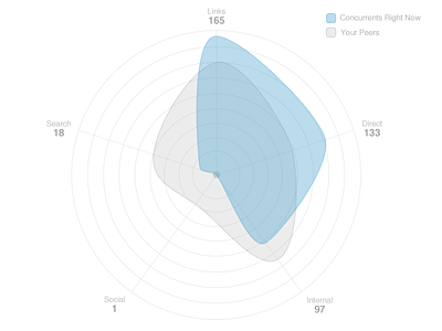
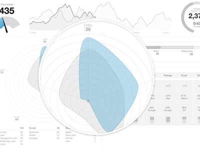
Here is a full view of the radar chart. It might help with some of the questions being asked. It is meant to visualize traffic sources breakdown.
You should follow me on twitter for updates.
4 months ago
Pro
Rob Hunter
Matt, love this. However, it's a little odd that the historical chart above uses the same grey as the "your peers", which makes me think the grey here is historical when it's not. Probably already resolved this in GD.
3 months ago
Pro
Matt Bango
@Rob Hunter - great feedback on that. It's something that was overlooked and only realized not too long ago. It's a real challenge to represent different types of context in a similar, yet different way.
3 months ago
Pro
Rob Hunter
Most definitely, and totally understand. Super stoked to see this stuff in action!
3 months ago