Find designers
Designer search
Quickly find your next designer
Post a job
The #1 job board for design talent
Inspiration
Courses
UX Diploma
Learn UX design from scratch in 6 months
UI Certificate
12-week UI skill building for designers
Live interactive workshops
with design professionals
Jobs
Go Pro
Log in
Dribbble: the community for graphic design
Log in
Sign up
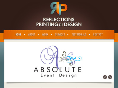
Reflections Printing Home Page
Mark Popkes
Follow
Following
Like
#FBFBF9
#311E19
#E36F03
#B3ADAC
#536668
#898D89
#A05A1F
Download color palette
A redesign for a printing and design company.
clean
earthy
homepage
ribbon
slider
View all tags
Posted on Feb 10, 2012
1,130
1
11
4
View feedback
Mark Popkes
More by Mark Popkes
View profile
Previous
Next
Loading…