Find designers
Designer search
Quickly find your next designer
Post a job
The #1 job board for design talent
Inspiration
Courses
UX Diploma
Learn UX design from scratch in 6 months
UI Certificate
12-week UI skill building for designers
Live interactive workshops
with design professionals
Jobs
Go Pro
Log in
Dribbble: the community for graphic design
Advance your career with a Professional Diploma in UX Design
Learn more
Log in
Sign up
Typedia Redux
Jason Santa Maria
Follow
Following
Like
#EAEAEA
#34302B
#4C4945
#999898
#3499CC
#807E7B
#9ACBE4
Download color palette
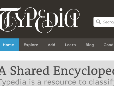
Some rough comp work on the
Typedia
revamp we've been pecking away at.
blue
brown
typed
white
View all tags
Posted on Feb 9, 2012
3,936
3
103
13
View feedback
Jason Santa Maria
More by Jason Santa Maria
View profile
Previous
Next
Loading…