Find designers
Designer search
Quickly find your next designer
Post a job
The #1 job board for design talent
Inspiration
Courses
UX Diploma
Learn UX design from scratch in 6 months
UI Certificate
12-week UI skill building for designers
Live interactive workshops
with design professionals
Jobs
Go Pro
Log in
Dribbble: the community for graphic design
Log in
Sign up
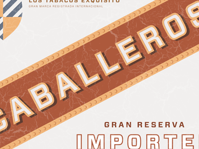
Caballeros
Hoefler&Co.
Follow
Following
Like
#F1EFEE
#AC583B
#EBAE74
#E5BA94
#664942
#B67055
Download color palette
Sneak peek of a forthcoming font release. Keep an eye on
http://www.typography.com
.
cigar box
forza
hco
label
packaging
sans
typography
View all tags
Posted on Aug 4, 2010
8,188
6
164
33
View feedback
Hoefler&Co.
Welcome to my design portfolio on Dribbble
More by Hoefler&Co.
View profile
Previous
Next
Loading…