SPACED Logo Refined

Hey There!
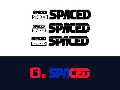
After a long hours of refining it and tweaking it. Here is the final output of the three logos I enjoyed exploring. I fall in-love with the second logo and decided to continue with it then apply some colors. I might try to think another perspective like decreasing it's weight but, for now here it is.
What I like about the second logo is it's distinct form and boldness see the letter "S". I believe it also pass the usability testing. And, I'm very excited to add it in the website, space suit, shirt and other product of the company that will make it more relevant to the project. For now, I love to hear your feedback and please let me know what you think about the other variation.
PS: Don't forget to check @Dann Petty #SPACEDChallenge and I'm encouraging all my friends to join and have fun! :)