Find designers
Designer search
Quickly find your next designer
Post a job
The #1 job board for design talent
Inspiration
Courses
UX Diploma
Learn UX design from scratch in 6 months
UI Certificate
12-week UI skill building for designers
Live interactive workshops
with design professionals
Jobs
Go Pro
Log in
Dribbble: the community for graphic design
Log in
Sign up
Type Manual
Justin Stahl
Follow
Following
Like
#F0F0F0
#A8A6A6
#070606
#9F1310
#624C4C
#D32E2A
#DFA49F
#C3827D
Download color palette
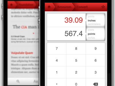
app
interface
ios
ipad
iphone
navigation
typography manual
ui
user interface
View all tags
Posted on Feb 8, 2012
4,113
13
65
9
View feedback
Justin Stahl
More by Justin Stahl
View profile
Previous
Next
Loading…