Looks great dude. I'd say the top and bottom paddings on the age certificate need evening out, the bottom is too generous at the moment. Also, the heart looks a little tall - a big fat wide heart would be nicer :)
@Dan Eden Thanks. Yeah, that age certificate is a pain in the ass. Either I'm going crazy or it moves on it's own, especially between Safari and Webkit Nightly. I guess I'll have to try to fix it again.
As for the heart, right now I'm just using a unicode heart. I'm against using an image or a glyph font, but I'm gonna see what I can do with <svg> . :)
4 Responses
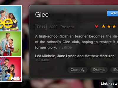
I'm aiming for smaller cover images and a more uniform information system to make the layout feel more even. I'd love to hear your thoughts.
See the current layout.
4 months ago
Stunning design.
I think this layout looks better than the actual live version in many ways (referring about the description box).
4 months ago
Looks great dude. I'd say the top and bottom paddings on the age certificate need evening out, the bottom is too generous at the moment. Also, the heart looks a little tall - a big fat wide heart would be nicer :)
4 months ago
@Dan Eden Thanks. Yeah, that age certificate is a pain in the ass. Either I'm going crazy or it moves on it's own, especially between Safari and Webkit Nightly. I guess I'll have to try to fix it again.
As for the heart, right now I'm just using a unicode heart. I'm against using an image or a glyph font, but I'm gonna see what I can do with <svg> . :)
4 months ago