Blind Concept Part 1/2

Was daydreaming in my car and suddenly this thought crossed my mind.
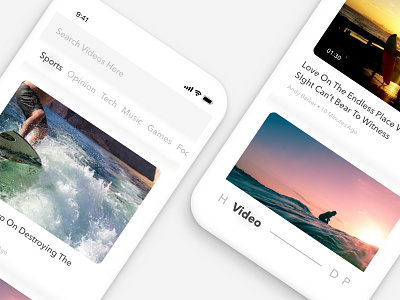
I've seen a lot of layouts using shadows and lines as a separator (which is good). In this concept, everything that ought to be separated by lines or shadows replaced by gradient. Not any gradient, but gradients that serves as a contour (add a sense of depth like braille, hence the name 'blind'). This way the base color is not obstructed by abrupt change in color.
One of the example is the container of the category which is filled by gradient #F5F5F5 to #FFFFFF and then ended by #F5F5F5. By doing that the container is visualized as a 'nudge' growing from the base color (#F5F5F5).
This is just a concept and maybe i'll try to make an app with this style. What do you guys think about this concept? If there's an app with this kind of style, please do tell me.
Mucha gracias guys!


