Find designers
Designer search
Quickly find your next designer
Post a job
The #1 job board for design talent
Inspiration
Courses
UX Diploma
Learn UX design from scratch in 6 months
UI Certificate
12-week UI skill building for designers
Live interactive workshops
with design professionals
Jobs
Go Pro
Log in
Dribbble: the community for graphic design
Log in
Sign up
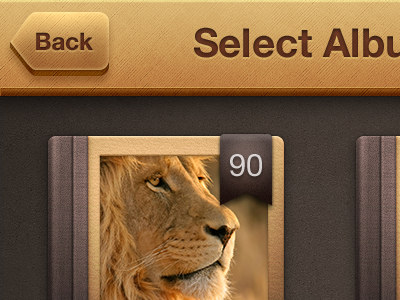
Select Album
Bogdan Mihaiciuc
Follow
Following
Like
#322A25
#654E3F
#986330
#D1A362
#BC8D55
#EBC991
Download color palette
Full view
here
.
Let me know what you think.
album
ios
photo
View all tags
Posted on Feb 3, 2012
6,713
24
156
17
View feedback
Bogdan Mihaiciuc
More by Bogdan Mihaiciuc
View profile
Previous
Next
Loading…