The only part of the hierarchy that isn't clear is the transition from good to great. Seems like, considering the brand and association with the color pink, it might be better suited for the epic badge. So I guess what I'm suggesting is swapping the great and epic colors.
The colors don't indicate a clear progression in rating (they sorta do, but the orangy color doesn't equate to high value).
That leaves you with borders to understand the rating at a glance. Epic really does look epic, but at small sizes it might be hard to make out quickly.
These are fun. Nice and clean. I think your note about indicating whether something is good or bad at a glance is big...also hard to get right. Size/color/ seem like the main levers you're playing with for that. Maybe there's something a bit more iconic/symbolic you can play with instead of the text labels... (: |: ): come to mind but are obviously a little lame and silly -- but they do have the effect that they communicate the sentiment at a quick glance...maybe there's something there...
Loving the designs! Here's a couple thoughts I had:
1) It's not really clear if "# oinks" is the total number of oinks or the number of oinks for a specific rating (e.g. Love, Like, etc.). For example, does "Good 92 oinks" equal (a) 92 Like ratings or (b) 92 total ratings with an average rating of Like? It might be worthwhile to put the number of oinks outside of the badge so as to improve understanding at a quick glance.
2) Great & Good and Meh & Poor are identical sans the color, which might confuse users or hinder UX because they have to think a little longer about it when glancing quickly. It might be worthwhile creating slightly different badges for Great & Good and Meh & Poor, though perhaps the real-world differences are nebulous (i.e. I wouldn't want a "Meh" or "Poor" dish).
3) I'm almost wondering if four badges make more sense than five, considering the point I discussed in #2. If the average user wouldn't want a "Meh" or "Poor" dish, they are, for all intents and purposes, the same thing to the consuming user (i.e. only discovers, doesn't Oink). Epic, Great and Good each have distinct value, but I'm not sure Meh and Poor as separate badges do...
15 Responses
Pro
Daniel Burka
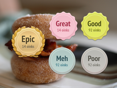
Working on new badges as part of a large design project on Oink. These should indicate at a glance whether or not something is any good.
over 1 year ago
These are awesome :)
over 1 year ago
Pro
Dalton
I vote Epic.
over 1 year ago
Smarties colors, awesome
over 1 year ago
Pro
Cap
The design for "Epic" is fantastic, dude.
over 1 year ago
the "meh" is sufficiently dull and meh, :)
really like these
over 1 year ago
Pro
Rob V
The only part of the hierarchy that isn't clear is the transition from good to great. Seems like, considering the brand and association with the color pink, it might be better suited for the epic badge. So I guess what I'm suggesting is swapping the great and epic colors.
That said, the epic badge is pretty epic.
over 1 year ago
Well done sir. Where is the "Clutch" badge?
over 1 year ago
Epic badge is epic!
over 1 year ago
Pro
Johan Bakken
Nice!
over 1 year ago
Pro
Terra Spitzner
Epic badge is awesome. Nice!
over 1 year ago
Epic design is epic.
over 1 year ago
Pro
Nathan
The colors don't indicate a clear progression in rating (they sorta do, but the orangy color doesn't equate to high value).
That leaves you with borders to understand the rating at a glance. Epic really does look epic, but at small sizes it might be hard to make out quickly.
The style is rad in any case :)
over 1 year ago
Pro
Kevin Twohy
These are fun. Nice and clean. I think your note about indicating whether something is good or bad at a glance is big...also hard to get right. Size/color/ seem like the main levers you're playing with for that. Maybe there's something a bit more iconic/symbolic you can play with instead of the text labels... (: |: ): come to mind but are obviously a little lame and silly -- but they do have the effect that they communicate the sentiment at a quick glance...maybe there's something there...
over 1 year ago
Pro
Luke Bornheimer
Loving the designs! Here's a couple thoughts I had:
1) It's not really clear if "# oinks" is the total number of oinks or the number of oinks for a specific rating (e.g. Love, Like, etc.). For example, does "Good 92 oinks" equal (a) 92 Like ratings or (b) 92 total ratings with an average rating of Like? It might be worthwhile to put the number of oinks outside of the badge so as to improve understanding at a quick glance.
2) Great & Good and Meh & Poor are identical sans the color, which might confuse users or hinder UX because they have to think a little longer about it when glancing quickly. It might be worthwhile creating slightly different badges for Great & Good and Meh & Poor, though perhaps the real-world differences are nebulous (i.e. I wouldn't want a "Meh" or "Poor" dish).
3) I'm almost wondering if four badges make more sense than five, considering the point I discussed in #2. If the average user wouldn't want a "Meh" or "Poor" dish, they are, for all intents and purposes, the same thing to the consuming user (i.e. only discovers, doesn't Oink). Epic, Great and Good each have distinct value, but I'm not sure Meh and Poor as separate badges do...
Hope that helps!
over 1 year ago