@John Leschinki was actually wondering the same thing, although, this dropdown menu doesn't go all the way to the right of the input field. So you would see that it's overlapping the field a bit. Not sure what's best. This detail is bothering me…
If no suggestions come up then it would look odd if it squared up on focus, Maybe put a small white square at the top of the list that covers that area when the list appears.
7 Responses
Pro
Veerle Pieters
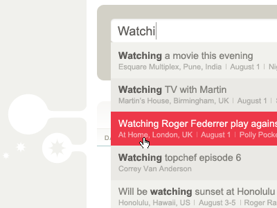
Working on one of the designs for a new feature for the fabulis website that will be implemented soon.
almost 2 years ago
Pro
Julien Cornic
very clean and nice colors!
almost 2 years ago
Pro
John Leschinki
Maybe bump the whole list up a bit to cover the bottom curve of the search box?
almost 2 years ago
Pro
Veerle Pieters
Thanks :)
@John Leschinki was actually wondering the same thing, although, this dropdown menu doesn't go all the way to the right of the input field. So you would see that it's overlapping the field a bit. Not sure what's best. This detail is bothering me…
almost 2 years ago
Pro
Petra Gregorová
could you on focus have the bottom left border of input field to just become square? Or would that be too weird too... hmmmm
Looking stunning though so far, I must say. As always!
almost 2 years ago
Pro
John Leschinki
If no suggestions come up then it would look odd if it squared up on focus, Maybe put a small white square at the top of the list that covers that area when the list appears.
almost 2 years ago
Pro
Petra Gregorová
@John Leschinki I like your suggestion better ;-)
almost 2 years ago