R pre final


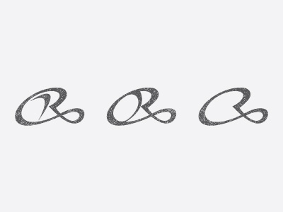
probably pre final version of the logo. subtle effects added to be even more attractive. hope you like it and there is improvement :)
probably pre final version of the logo. subtle effects added to be even more attractive. hope you like it and there is improvement :)