Find designers
Designer search
Quickly find your next designer
Post a job
The #1 job board for design talent
Inspiration
Courses
UX Diploma
Learn UX design from scratch in 6 months
UI Certificate
12-week UI skill building for designers
Live interactive workshops
with design professionals
Jobs
Go Pro
Log in
Dribbble: the community for graphic design
Log in
Sign up
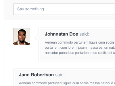
Comments
Ionut Zamfir
Available for work
Follow
Following
Like
Get in touch
#FBFBFB
#B8BDC6
#9BA0AB
#413735
#717A8B
#A16047
Download color palette
cibando
clean
comments
ui
widget
View all tags
Posted on Jan 29, 2012
6,522
15
119
9
View feedback
Ionut Zamfir
Freelance designer with a huge passion for clean interfaces.
Get in touch
More by Ionut Zamfir
View profile
Previous
Next
Loading…
Loading…
Loading…