Logo - A brand face


We designed this brand identity for a E-Commerce web application.
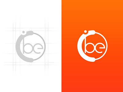
It includes the logo, wordmark, color palette, recommended typeface family, etc. The idea of the logo was to communicate something which a human mind always craves for that little something extra. Beyond Enough is all about youth, energy, breaking your own boundaries, going beyond infinity!
See more details about the logo here .
We're available for projects — Contact us


