Lunch tray


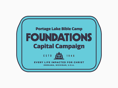


Here's a lockup for a camp's capital campaign to raise money for a new dining hall. The client picked another direction but I like the classic feel of this. I created/mimicked the type for FOUNDATIONS inspired by the attached retro logo for some caves we went to last summer. I just came to learn that the type in the logo is actually a font, Kabel Black.


