Rot wine bar identity

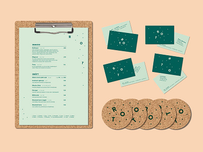
Identity for Rot, a wine and tapas bar in Trondheim, Norway. As a reference to the wine and it's history, we used cork material for several of the physical applications. Rot in Norwegian means two things; messy and root. Although the food is based on the latter, the interior is messy, with a lot of different furniture etc to make people feel at home right away. This is also the approach for the generative logo and different layout on the business cards.
Made at Int in collaboration with Håvard Gjelseth, fall 2017.


