Rot wine bar identity

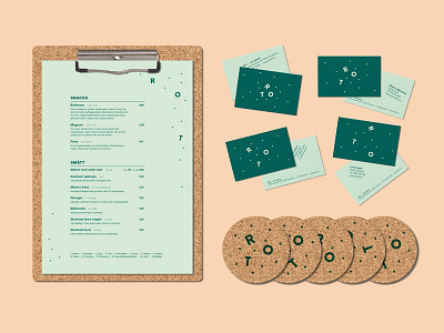
Identity for Rot, a wine and tapas bar i Trondheim, Norway. As a reference to the wine and it's history, we used cork material for several of the physical applications. Rot in Norwegian means two things; messy and root. Although the food is based on the latter, the interior is messy, with a lot of different furniture etc, to make people feel at home right away. This is also the approach for the generative logo and different layout on the business cards.


