


Geodeci

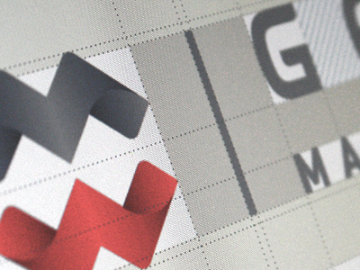

Geodesy. M + W are the initials of the company's owner. Client wanted neo approach on it. Typography is custom - made. Corporate identity is on the way, now. Bigger photoshot: http://miloszklimek.pl/#31
Geodesy. M + W are the initials of the company's owner. Client wanted neo approach on it. Typography is custom - made. Corporate identity is on the way, now. Bigger photoshot: http://miloszklimek.pl/#31


