


Debunk'd - Gibson

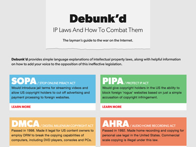
Concept for a site explaining (problems with) copyright legislation in simple language.
This version uses the Gibson typeface, instead of Profonts Bureau.
Concept for a site explaining (problems with) copyright legislation in simple language.
This version uses the Gibson typeface, instead of Profonts Bureau.


