Find designers
Designer search
Quickly find your next designer
Post a job
The #1 job board for design talent
Inspiration
Courses
UX Diploma
Learn UX design from scratch in 6 months
UI Certificate
12-week UI skill building for designers
Live interactive workshops
with design professionals
Jobs
Go Pro
Log in
Dribbble: the community for graphic design
Log in
Sign up
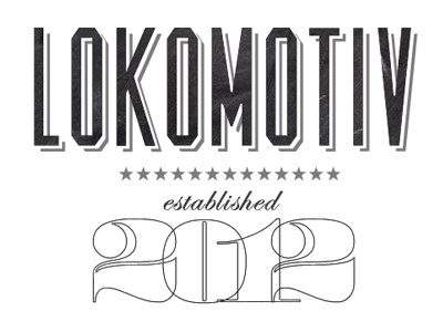
Lokomotiv
Caleb Royce Lummer
Follow
Following
Like
#FDFDFD
#312F31
#656465
#BFBFC0
#A0A0A0
Download color palette
Some basic preliminary type for a dev shop I was asked to design a logo for.
black
design
logo
lost type
numbers
typography
white
View all tags
Posted on Jan 22, 2012
2,015
5
105
16
View feedback
Caleb Royce Lummer
Dribbble
More by Caleb Royce Lummer
View profile
Previous
Next
Loading…