Progressive Architecture – Web Concepts #8


Feedback welcomed and appreciated!
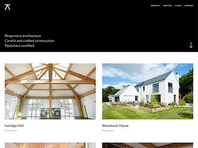
Getting somewhere now.
It's been a challenging process to bring in the colour palette and graphic elements of the brand, without hindering or distracting people away from the quality of Progressive's work.
I've stripped back the colour as much as possible – whilst still leaving a nice big footer at the bottom that demonstrates the signature gradient and moire wave (so trendy, I know).
Generally happy with how the style and layout are developing as I'm taking it through revisions.


