Find designers
Designer search
Quickly find your next designer
Post a job
The #1 job board for design talent
Inspiration
Courses
UX Diploma
Learn UX design from scratch in 6 months
UI Certificate
12-week UI skill building for designers
Live interactive workshops
with design professionals
Jobs
Go Pro
Log in
Dribbble: the community for graphic design
Log in
Sign up
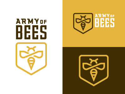
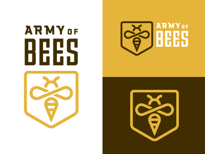
Army of Bees 2
Bobby McKenna
Follow
Following
Like
#FFFFFF
#E5B53B
#402E00
#E7D5A8
#6D5720
#927221
#A39B84
Download color palette
Revised.
Rebound of
Army of Bees 1
By
Bobby McKenna
army
bee
logo
revision
View all tags
Posted on Jul 29, 2010
3,976
9
80
12
View feedback
Bobby McKenna
More by Bobby McKenna
View profile
Previous
Next
Loading…