


Interactive Data Viz

Wanted to share a spin off data visualization chart that I have been working on thats an evolution of a project I’ve been spearheading called Interactive Reports.
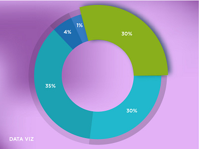
The idea of the platform is to provide a high-level summary of the members using the product. Its not to fully replace the statement received but allow them to get easy breakdowns of the data that they are looking for. This is a close up of data visualization I created to break down earnings for royalties!
Hope you enjoy!


