Looks terrific! Really love that 'y', the straight descender goes so well with the overall feel of the letterforms. I also really like your update removing the little stroke that was crossing over the 'L' stem - it fits much nicer next to the 'C'. The spacing there looks good too, although could maybe be a little closer still? Anyway looks really good, I love seeing the transition from the sketch.
Looks great! Agree that the 'layton' could move just a tad closer to the 'C'. Also, the stroke width of the 'n' feels a touch heavy. Overall very nice!
7 Responses
Pro
Travis Fleck
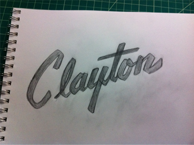
Thanks all and thanks for the feedback Claire. I did quite a bit of tweaking. Not sure if it is there or not. I've been looking at it for a while now.
4 months ago
Pro
Claire Coullon
Looks terrific! Really love that 'y', the straight descender goes so well with the overall feel of the letterforms. I also really like your update removing the little stroke that was crossing over the 'L' stem - it fits much nicer next to the 'C'. The spacing there looks good too, although could maybe be a little closer still? Anyway looks really good, I love seeing the transition from the sketch.
4 months ago
Pro
Sean McCabe
Looks great! Agree that the 'layton' could move just a tad closer to the 'C'. Also, the stroke width of the 'n' feels a touch heavy. Overall very nice!
4 months ago
Pro
Travis Fleck
Thanks! The 'n' is a bit big boned. The 'C' has been giving me trouble too.
4 months ago
Pro
Jens Obel
I absolutely love the chunky "N" :D Maybe the top of the "C" could be a bit thicker?
4 months ago
Awesome! Just to add more questions - could the 'l' and the 'a' be smidgen bigger?
4 months ago
Pro
Travis Fleck
I think you are right Ray.
4 months ago