Sharks

Very happy to present the Identity work I did for local AFL Football team The Southport Sharks. To view the full presentation you can head over HERE. There's also a little video launch the brand that does aa bit of a profile on me if you're interested in watching.
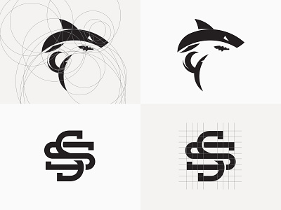
For me the shark was always going to be the most challenging aspect of this new logo. If I nailed the shark, I felt confident everything else would fall in to place.
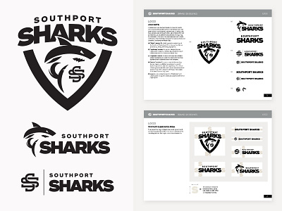
This shot shows a variety of the lock-ups that will be used for different environments along with a couple of screenshots of the brand book style guide I had to put together.