Airo
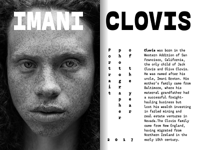
Airo began as an experiment. I wanted to see what would happen if I combined two features that were trendy in type design at the time: inverted contrast and monospace proportions. The result, while odd, is surprisingly functional and has a bucketload of personality.
The lighter weights are more mellow and usable for medium length texts while the bolds scream for attention. Airo comes in six weights and is equipped with lining and old style figures, superiors, inferiors and fractions + a latin extended character set.
The medium weight is available for free so head over to MyFonts and grab it!
View all tags
Posted on
Nov 2, 2017
More by Teo Tuominen View profile
Like


