Find designers
Designer search
Quickly find your next designer
Post a job
The #1 job board for design talent
Inspiration
Courses
UX Diploma
Learn UX design from scratch in 6 months
UI Certificate
12-week UI skill building for designers
Live interactive workshops
with design professionals
Jobs
Go Pro
Log in
Dribbble: the community for graphic design
Log in
Sign up
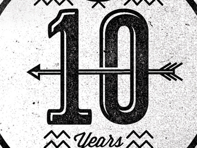
PRS 10 Year Crest Pt2
Adam Grason
Available for work
Follow
Following
Like
Get in touch
#F1F1F1
#121212
#C1BFC0
#413F3F
#5C5B5C
#817F7F
Download color palette
Not a hundred percent sure on the type face for the 10. Anyone have any recommendations?
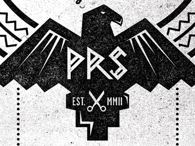
Rebound of
PRS 10 Year Crest
By
Adam Grason
crest
eagle
falcon
indian
lockup
logo
mark
tribal
View all tags
Posted on Jan 19, 2012
3,567
7
60
6
View feedback
Adam Grason
Creator Of Joy Through Design
Get in touch
More by Adam Grason
View profile
Previous
Next
Loading…
Loading…
Loading…