Find designers
Designer search
Quickly find your next designer
Post a job
The #1 job board for design talent
Inspiration
Courses
UX Diploma
Learn UX design from scratch in 6 months
UI Certificate
12-week UI skill building for designers
Live interactive workshops
with design professionals
Jobs
Go Pro
Log in
Dribbble: the community for graphic design
Log in
Sign up
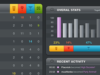
PartySmasher / Dashboard
musho
Follow
Following
Like
#3E4347
#989CA1
#C7893F
#D6CCDC
#319FBE
Download color palette
Dashboard 4 PartySmasher
dashboard
digital
drinking
ipad
mobile
party
signage
smasher
social
View all tags
Posted on Jan 19, 2012
12,527
44
300
12
View feedback
musho
Throwing Pixels Around
More by musho
View profile
Previous
Next
Loading…