News Website Sidebar Rework

From time to time I come across an element on the web that just seems to be... "off". At least to me anyway.
I use this opportunity to do 2 things:
1. Think critically about the purpose of a digital artifact
2. Flex some design chops with a quick "rework"
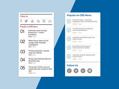
On this occasion it was a sidebar on the CBS News website. A few things stuck out to me: the ordering of social ahead of content, the lack of typographical hierarchy, and the colors (doesn't CBS use blue?).
My rendition does away with a lot of the design noise and attempts to improve readability. On a website that deals in headlines, a fluid user experience is key.
Enjoy!


