itsfilmtastic iPhone Icon Design v2

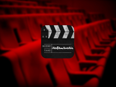
After realising that the font I used on the last icon was very similar to the Facebook font, I decided to go for a different take on the icon. Film related but something a little different from the rest of the website.
Thoughts?
This is my first reall attempt as a proper iPhone icon as most clients just want their logo put in it.