Find designers
Designer search
Quickly find your next designer
Post a job
The #1 job board for design talent
Inspiration
Courses
UX Diploma
Learn UX design from scratch in 6 months
UI Certificate
12-week UI skill building for designers
Live interactive workshops
with design professionals
Jobs
Go Pro
Log in
Dribbble: the community for graphic design
Log in
Sign up
32px Icons
Pranav Pramod
Available for work
Follow
Following
Like
Get in touch
#EBF0F6
#C5C0BD
#494A49
#D8B25C
#DE5857
#657998
#AB5532
Download color palette
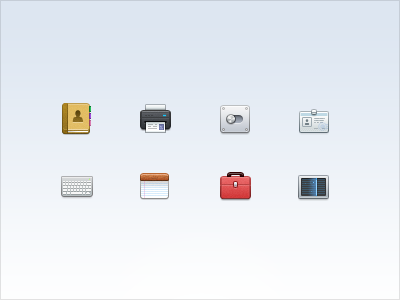
32px icons for a project!
32
32px
book
card
general
icon
icons
printer
toolbox
View all tags
Posted on Jan 16, 2012
8,177
34
257
25
View feedback
Pranav Pramod
Get in touch
More by Pranav Pramod
View profile
Previous
Next
Loading…
Loading…
Loading…