Blog Post Meta Data

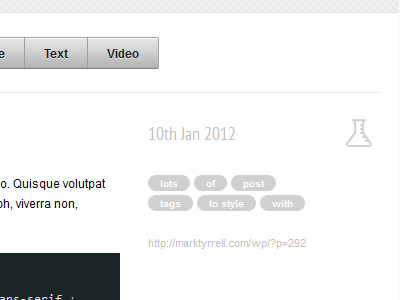
Moving full steam ahead with the design for my new website/portfolio/blog. This is the blog post meta data, I'm really happy with the layout, my concern is it might be too light a shade of grey. Any thoughts?
Moving full steam ahead with the design for my new website/portfolio/blog. This is the blog post meta data, I'm really happy with the layout, my concern is it might be too light a shade of grey. Any thoughts?


