Find designers
Designer search
Quickly find your next designer
Post a job
The #1 job board for design talent
Inspiration
Courses
UX Diploma
Learn UX design from scratch in 6 months
UI Certificate
12-week UI skill building for designers
Live interactive workshops
with design professionals
Jobs
Go Pro
Log in
Dribbble: the community for graphic design
Advance your career with a Professional Diploma in UX Design
Learn more
Log in
Sign up
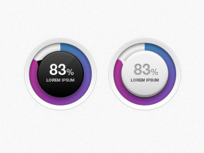
Charts 2
David Stinnette
Follow
Following
Like
#F0F0F0
#A4A4A6
#362E38
#99429E
#655DA5
#6C8FBA
#683D92
#883578
Download color palette
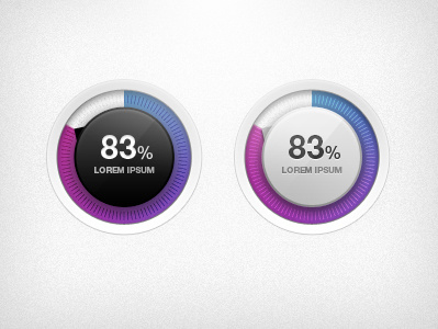
Incorporated Dribbbler feedback.
How about now? I'm liking them both about equally.
Rebound of
Charts
By
David Stinnette
chart
clean
diagnostics
dial
knob
modern
View all tags
Posted on Jan 13, 2012
5,497
32
167
10
View feedback
David Stinnette
More by David Stinnette
View profile
Previous
Next
Loading…