Find designers
Designer search
Quickly find your next designer
Post a job
The #1 job board for design talent
Inspiration
Courses
UX Diploma
Learn UX design from scratch in 6 months
UI Certificate
12-week UI skill building for designers
Live interactive workshops
with design professionals
Jobs
Go Pro
Log in
Dribbble: the community for graphic design
Log in
Sign up
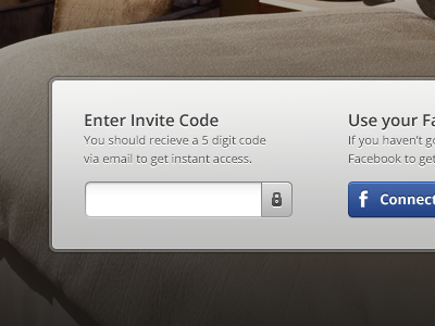
Enter Invite Code
James
Available for work
Follow
Following
Like
Get in touch
#E2E1E1
#302A25
#71675D
#ACA9A5
#8E8579
#4D4137
#36579B
Download color palette
Working on the final page for WMGM - this project has been a ride!
cards
green
grid
icons
payment
progress bar
red
stage
ui
ux
visa
wmgm
View all tags
Posted on Jan 13, 2012
20,561
45
291
19
View feedback
James
Designer at Wireframe Design Studio
Get in touch
More by James
View profile
Previous
Next
Loading…
Loading…
Loading…