Converting icons to bar graphs

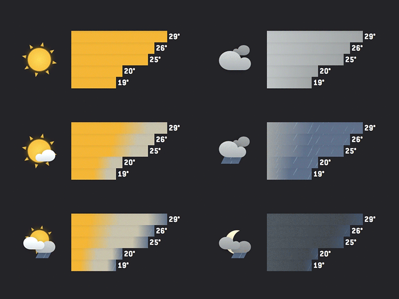
The biggest challenge for this project was trying to see if there was a way to condense the hourly forecast data into something that could be understood with a quick glance. Here's what converting each hour's forecast icon into a bar graph looked like.
Blog post and live links to come...


